How to Choose the Right Paper for Your Fine Art Prints
A fine art print is shaped by more than the image itself. The paper’s surface, weight, brightness, texture, and finish all influence how colors appear and how the finished piece feels in the hand. A carefully selected sheet can make a photograph look richer, soften a portrait, or add a gallery-quality character to a landscape.
The best choice depends on the image, the intended display, and the mood you want the print to create. A dramatic black-and-white photograph may benefit from a deep matte surface, while a colorful botanical image might need a smoother sheet that preserves fine detail and saturation.
Paper selection also matters for practical reasons. A large print for framing has different needs than a small portfolio image, a greeting card, or a photograph that will be handled frequently. Understanding the main differences helps you order with confidence and get results that reflect the original vision.
Understand how surface changes the image
Paper surface describes the way light interacts with the printed sheet. Glossy paper has a smooth coating that reflects light and can produce vivid colors, strong contrast, and crisp detail. It is often effective for highly saturated photographs, sharp architectural images, and scenes where visual impact is the priority.
Matte paper has little or no visible reflection, making it easier to view under varied lighting. Its subdued appearance can give portraits, documentary photographs, and black-and-white work a refined quality. Matte surfaces may reduce the perceived intensity of some colors, but they often create a softer and more contemplative presentation.
Luster and semi-gloss papers sit between glossy and matte. They provide attractive color depth while controlling reflections more effectively than a high-gloss sheet. This versatile surface is a practical choice for family portraits, event photography, travel images, and prints that will be viewed in rooms with windows or overhead lighting.
Match the paper to the photograph
Start by examining the visual qualities of the image rather than choosing paper based only on personal habit. Photographs with intricate textures, bright highlights, or strong color separation often benefit from a smooth surface that retains sharpness. Images with gentle transitions and subdued tones may look more natural on a lightly textured or matte sheet.
Portraits can work well on papers with a softer finish because the reduced reflection draws attention to expression and skin tones. For black-and-white photographs, consider a paper that supports rich shadow detail without making darker areas appear flat. A warmer paper tone can add an archival, traditional feeling, while a bright white base can create a cleaner and more contemporary result.
Landscapes and nature images offer more flexibility. Glossy or luster paper can emphasize water, foliage, and colorful skies, while a textured fine art sheet can make the image feel like a physical artwork rather than a reproduction. If the photograph includes both delicate highlights and deep shadows, a professional lab can help you compare surfaces before committing to a large print.
Consider weight, color, and texture
Paper weight affects how substantial a print feels. Lightweight photo paper is suitable for albums, proof sheets, and projects that will be stored in sleeves. Heavier stock provides a more impressive presentation for portfolios, exhibition prints, and unframed artwork. It also resists bending more effectively during handling.
The paper’s base color influences the image’s overall mood. Bright white paper tends to preserve a clean, neutral appearance and can make colors look lively. Natural or warm white stock may complement vintage photographs, muted palettes, and images where a softer visual effect is desirable. A subtle difference in paper tone can change how whites, skin tones, and pale backgrounds are perceived.
Texture adds another creative dimension. Smooth papers reveal fine detail with precision, while lightly textured surfaces can disguise minor imperfections and contribute a painterly character. Heavier textures may be appealing for expressive landscapes or artwork intended for close viewing, but they can compete with photographs that depend on extremely fine lines.
| Paper type |
Visual character |
Well suited to |
Points to consider |
| Glossy |
Vivid, reflective, high contrast |
Colorful scenes, sharp details, modern images |
Can show glare and fingerprints |
| Luster or semi-gloss |
Balanced color and controlled reflection |
Portraits, travel photos, general display |
A versatile choice when the setting is uncertain |
| Matte |
Soft, non-reflective, elegant |
Black-and-white work, portraits, intimate images |
Colors may appear less intense |
| Smooth fine art |
Detailed, refined, gallery-oriented |
Exhibition prints and portfolios |
Requires careful handling |
| Textured fine art |
Tactile, painterly, distinctive |
Landscapes, expressive artwork, creative photography |
Texture can affect small details |
Think about viewing distance and display
The intended size of the print should influence your paper decision. At a small size, subtle texture may be difficult to notice, while a heavily textured surface can become a major part of a large wall piece. Large-format prints are typically viewed from several feet away, so strong composition and tonal balance matter more than minute surface differences.
Lighting is equally important. A glossy print may look spectacular in a controlled space but produce distracting reflections near a window. Matte and luster surfaces are often easier to enjoy in homes, offices, galleries, and retail environments where lighting changes throughout the day.
Framing adds another consideration. Prints displayed behind glass may already have a reflective layer, so choosing a very glossy paper can increase glare. A matte or luster surface may create a more comfortable viewing experience. For artwork mounted without glass, paper texture and weight become more visible and contribute directly to the finished presentation.
Review the print’s purpose and color style
A paper that works for a personal portfolio may not be the right choice for a gift or wall decoration. If the print will be handled regularly, durability and a practical finish may matter more than subtle texture. If it will be framed as a permanent artwork, you can prioritize the paper’s visual character and how well it supports the room’s design.
Color style can guide the decision, too. High-key images with pale backgrounds may need a bright base to preserve clarity. Moody photographs with subdued contrast can gain depth from a matte surface. Rich reds, greens, and blues often appear more energetic on a smooth or luster paper, while earth tones may look particularly attractive on a warmer fine art stock.
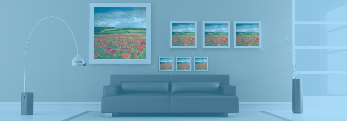
When your project includes several images, consistency matters. Using one paper family across a portfolio or collection creates a unified appearance, even when the photographs have different subjects. For a gallery wall, you can also coordinate the paper with the room’s style by exploring themed photo products alongside prints and wall decor.
Prepare the file before ordering
Paper cannot correct every issue in a digital file. Before ordering, check image resolution, cropping, color space, and the intended print dimensions. A file that looks excellent on a phone may reveal softness, unwanted noise, or clipped highlights when enlarged. Accurate preparation gives the selected paper a better chance to reproduce the photograph successfully.
Soft proofing can help you anticipate how the image may change on a particular surface. Matte papers often absorb more light visually, which can make shadows and colors appear gentler than they do on a monitor. Your screen should be reasonably calibrated, but a physical test print remains the most dependable way to evaluate paper, especially for an exhibition piece or large wall print.
If the source image is an old family photograph, scan quality is also important. A high-quality shoebox photo scanning service can create a cleaner digital file before you decide on paper, size, and finish. This is useful when faded prints, negatives, or loose snapshots are being transformed into new artwork.
Use a practical selection checklist
A small test print can reveal details that are difficult to predict from online descriptions. Compare the same image on two or three surfaces and view each sample under the lighting where it will eventually be displayed. Look at skin tones, shadow detail, highlight transitions, texture, and the amount of reflection.
When working with a professional photo lab, describe the image and its intended use. A lab team can often point out differences between papers, recommend a suitable finish for framing, and help you decide whether a standard photographic sheet or fine art stock is the better fit. Local assistance is especially valuable when you are ordering large prints or producing a coordinated collection.
Use these questions as a starting point:
- Is the image primarily colorful, monochromatic, soft, or highly detailed?
- Will the print be framed behind glass, mounted, or handled often?
- Does the display space have bright windows or strong overhead lighting?
- Would a smooth, matte, luster, or textured surface support the image’s mood?
- Should the final piece feel modern, understated, tactile, or gallery-oriented?
Turn a considered choice into finished artwork
Paper selection is part of the creative process, not a technical detail to leave until the final order screen. The right surface supports the photograph’s subject, protects its visual character, and helps the finished print fit naturally into its surroundings. When size, lighting, display method, and file quality are considered together, the result feels intentional from edge to edge.
The Photo Place serves photographers and families in the Youngstown area with digital printing, large-format output, professional finishing, framed artwork, albums, and other presentation services. Whether you are printing a single favorite image or preparing a complete collection, bring your files or project ideas to a lab that can help match the paper to the purpose.
Order a test print or speak with The Photo Place about your next fine art project, then give your image the paper and presentation it deserves.