How to Photograph Artwork for High-Quality Reproductions
A faithful artwork reproduction begins before the camera is switched on. The original may be a watercolour, oil painting, charcoal drawing, print, collage or mixed-media piece, and each surface responds differently to light. Your aim is to record its colour, texture, proportions and fine detail without adding glare, distortion or unwanted shadows.
Good technique matters whether the final image will appear in an online catalogue, an exhibition brochure, a social media post, a greeting card or a large archival print. Australian artists also need to account for strong daylight, warm interiors and the practical demands of working in homes, studios and galleries from Melbourne to Brisbane.
Choosing the Right Setup
A camera with manual controls will give you greater consistency than a phone, although a recent phone can produce useful reference images in good light. A mirrorless or DSLR camera with a standard lens around 50–100mm is a reliable choice. Avoid wide-angle lenses because they exaggerate the distance between the centre and edges of the artwork, making a rectangular piece look distorted.
Mount the camera on a sturdy tripod and position it directly in front of the artwork. The lens should be level with the centre of the piece, with the sensor parallel to its surface. Use a spirit level or the grid display on your camera to check alignment. Even a small angle can make one side of a framed print appear wider than the other.
Remove glass from a framed work when it is safe to do so. Reflections from windows, ceiling lights and pale walls can be difficult to eliminate later. If the glass cannot be removed, photograph in a darkened room, switch off nearby lights and place the camera so reflected shapes fall outside the lens. For artists preparing professional output, a lab’s printing and finishing services can help turn a carefully captured file into a proof, framed piece or exhibition print.
Controlling Light and Colour
Two identical lights placed at 45-degree angles to the artwork are a dependable arrangement. They should be the same type, brightness and colour temperature, and should sit at equal distances from the work. This cross-lighting reduces uneven illumination while revealing moderate surface texture. For glossy paint or varnish, move the lights farther to the sides or raise them slightly until the bright reflection leaves the lens.
Soft, diffused light is usually best for watercolours, photographs and works under glass. Large windows can provide beautiful illumination, but Australian sunlight can be intense, especially in north-facing rooms and during summer. Direct sun changes quickly and may create hot spots. Use a sheer curtain, blackout fabric or a studio diffuser, and avoid mixing blue daylight with yellow household bulbs.
Place a neutral grey card or colour chart beside the artwork for the first test frame. This gives you a reference for correcting white balance and exposure. Take the test image under the same lighting used for the artwork, then remove the card before making the final capture. A calibrated monitor is valuable when subtle differences in cream paper, skin tones or muted pigments matter.
Keeping Artwork Flat and Sharp
Small drawings and unframed prints can be photographed vertically or laid flat. A flat setup is often convenient, but the camera must remain perfectly parallel to the surface. Place the artwork on a clean, neutral background and use archival corners or low-tack hinges if it needs to be held down. Never attach adhesive directly to a fragile paper surface.
For canvases and boards, check whether the surface is bowed. A curved original cannot be made geometrically accurate through camera positioning alone. If the work is valuable or delicate, consult a conservator before flattening, removing backing or taking it out of a frame. Dust the lens and inspect the artwork for loose fibres, fingerprints and stray hairs, but do not clean the surface with household products.
Autofocus may select a distracting edge or a high-contrast mark, so use a single focus point near the centre and then check the corners at high magnification. A stopped-down aperture such as f/8 or f/11 generally provides useful sharpness, although very small apertures can soften detail through diffraction. Use a remote shutter release or a two-second timer to prevent movement.
Camera Settings and Capture
Shoot in RAW format when the camera supports it. RAW files retain more information for correcting exposure, colour and highlights than compressed JPEGs. Set the ISO as low as practical, usually 100 or 200, to minimise grain in broad areas such as skies, washes and unpainted paper. Let the tripod handle slow shutter speeds rather than increasing ISO.
Begin with manual exposure and review the histogram. Keep important highlights from clipping, particularly in white paper and pale paint. Take several exposures at slightly different brightness levels if the work contains both deep blacks and reflective whites. Bracketing is useful, but it does not replace consistent lighting or careful colour management.
Record the artwork straight on, then take a second image showing the frame, edges and surface. The full view is suitable for reproduction, while the detail image documents brushwork, embossing or paper grain. Keep the original capture untouched and make working copies for cropping, retouching and resizing.
Photographers working with film originals should also keep handling and packing under control. Negatives, slides and artwork transparencies can be damaged by fingerprints, dust and poor storage. Before sending film away, follow a reliable mailing film guide so the materials arrive protected and clearly identified.
Finishing Files for Print
Correct perspective before adjusting colour. Use the edges of the artwork as guides, but do not crop away a painted border, deckled edge or signature unless the reproduction brief requires it. If the original has a non-rectangular shape, create a clean clipping path or transparent background while retaining a separate file with the complete object.
Colour correction should be subtle and documented. Compare the screen image with the original under neutral light, not under a warm lamp or beside a bright window. Correct unwanted colour casts, set a sensible white point and avoid increasing saturation simply because it looks attractive on an uncalibrated display. Strong saturation can produce an inaccurate print and may push some pigments beyond the chosen colour space.
Save a high-resolution master file and export separate versions for each purpose. A print file may need greater dimensions and a suitable colour profile, while an online catalogue needs a smaller, sharpened JPEG or WebP. Keep the original resolution, crop, colour profile and editing history in the master. Name files consistently with the artist, title, date and version number.
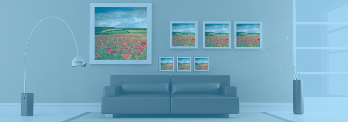
If the artwork will be printed at a local lab, ask about preferred file formats, colour profiles, paper types and maximum print sizes before final export. A fine-art paper can add pleasing texture, while a smooth photographic paper may suit detailed line work. Request a proof for important commissions, particularly when the piece includes delicate neutrals or saturated reds.
Building a Reliable Studio Workflow
A repeatable process is more valuable than a complicated one. Mark the tripod and light positions on the floor, record the camera height and keep a short note of the lighting setup. This is especially useful when photographing a series for a catalogue, because every image should share the same perspective, brightness and colour balance.
For artists in Australia, allow for practical conditions such as summer heat, changing daylight and limited studio space. In a sunny Perth room, blinds may be essential; in a compact Sydney apartment, a foldable copy stand can be more manageable than a full backdrop. In Melbourne’s changeable weather, artificial lights offer more dependable colour than waiting for a cloudless afternoon.
Use this checklist before each session:
- Clean the lens, sensor area, artwork support and background.
- Align the camera parallel to the artwork and verify the frame edges.
- Match the lights, diffuse harsh sources and eliminate reflected windows.
- Photograph a grey card or colour chart before the artwork.
- Capture RAW files at low ISO with a stable tripod and remote release.
- Inspect focus, histogram, corners and surface reflections at full magnification.
- Save an untouched master and create clearly named working copies.
A useful archive can include the final reproduction, a detail view, installation photographs, dimensions, materials, title, date and copyright information. If your collection includes unusual commissioned subjects or visual references, descriptive metadata will make them easier to find later; even niche material such as fruit machines and Litecoin benefits from consistent naming and image records.
The finished photograph should make the viewer feel close to the original without inventing detail or colour. Check it at 100 percent on screen, compare it with the artwork under neutral lighting and review a physical proof when the reproduction is important. A straight camera, controlled light, accurate colour reference and disciplined file handling provide the practical foundation for dependable artwork reproductions.