Matte vs. glossy finishes for photos that feel right
A photograph’s finish changes more than its surface texture. It affects color, contrast, viewing comfort, fingerprint resistance, and the way an image fits into a room. The same photograph can feel soft and nostalgic on matte paper, then become vivid and energetic when printed with a glossy coating.
Choosing between these photo finishes is easier when you consider the image, its purpose, and where it will be displayed. A family portrait, wedding album, landscape print, school picture, and promotional photograph may each benefit from a different treatment.
At The Photo Place, customers can order professional prints online or visit the Youngstown-area retail location for guidance. With decades of experience in film developing, digital printing, large-format output, and photo finishing, the lab can help turn a good image into a finished piece that looks intentional and lasts.
How the finish changes the photograph
Matte and glossy surfaces reflect light in different ways. Matte paper has a fine, subdued texture that scatters reflected light, reducing shine across the image. Glossy paper has a smoother surface that reflects more light directly, creating stronger highlights and a more polished appearance.
The finish also influences perceived sharpness. Glossy prints often make colors look deeper and details appear more defined, especially in images with crisp edges or rich contrast. Matte prints soften reflections and can give photographs a restrained, professional quality that keeps attention on the composition.
Neither finish is universally better. The right choice depends on whether you want brilliance or subtlety, maximum visual impact or easy handling, and a display print or something intended for frequent viewing.
When matte is the better choice
Matte photo paper works especially well for portraits, fine-art photography, black-and-white images, and pictures with a gentle or vintage mood. Its low-reflective surface allows viewers to see the image comfortably under different lighting conditions. This makes it a strong choice for framed photographs placed near windows, lamps, or overhead lights.
The texture of matte stock can also make minor fingerprints and small surface marks less noticeable. That benefit matters for prints that will be handled often, such as school portraits, event photographs, greeting cards, and images placed in albums. Matte finishes can give skin tones a natural appearance and keep delicate details from looking overly intense.
Photographers often choose matte when they want the print to feel tactile and artistic. It pairs well with muted colors, atmospheric landscapes, documentary photographs, and images where mood carries as much weight as technical sharpness.
When glossy creates more impact
Glossy prints are known for vibrant color, strong contrast, and a smooth, polished surface. They are a popular choice for vacation snapshots, colorful landscapes, action photographs, product images, and family pictures where bright visual energy is part of the appeal. Blue skies, green foliage, water, and saturated clothing tend to look especially lively on glossy stock.
Because the surface reflects light, glossy paper can make a print appear sharper and more dimensional. This can be useful for images with intricate architecture, fine textures, or dramatic contrast. Glossy enlargements often attract attention when displayed in an album, portfolio, or well-controlled interior space.
There are practical considerations, too. Glossy photographs can show fingerprints more readily, and glare may make them difficult to view under direct lighting. If a print will be touched frequently or displayed behind glass, consider the location before selecting a high-shine finish.
| Consideration |
Matte finish |
Glossy finish |
| Overall appearance |
Soft, refined, and low-reflective |
Bright, polished, and vibrant |
| Color character |
Subtle and natural |
Saturated and high-impact |
| Viewing comfort |
Easier under varied lighting |
Best with controlled lighting |
| Fingerprint visibility |
Lower |
Higher |
| Strong uses |
Portraits, fine art, albums, black-and-white images |
Landscapes, travel photos, colorful snapshots |
| Framing considerations |
Works well with or without glass |
May produce glare behind glass |
| Ideal impression |
Artistic and understated |
Crisp and energetic |
Match the finish to the display space
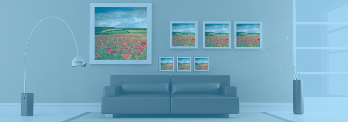
A print’s surroundings should influence the paper choice. Matte is often a smart option for rooms with abundant natural light because it reduces distracting reflections. In a hallway, office, waiting room, or gallery-style arrangement, its restrained appearance can help several photographs sit together without competing for attention.
Glossy prints can be effective in spaces where lighting is controlled and the image is meant to stand out. A colorful family portrait in a living room, a dramatic landscape in a den, or a vivid travel photograph in a home office may benefit from the extra saturation and contrast.
The mounting and framing method matters as well. When a photograph will be placed behind glass or acrylic, glare can come from both the print and the protective surface. In some situations, a matte or lustre-style finish offers a better balance between color richness and comfortable viewing. For larger wall pieces, consider the material as part of the design; this guide to canvas and metal prints explains how different surfaces affect the final presentation.
Think about handling and longevity
A photograph that will be passed around at an event has different needs from one that will remain mounted on a wall. Matte prints are generally easier to handle because they are less prone to visible fingerprints and distracting reflections. They are well suited to proof sheets, album pages, memorial displays, and prints that family members may examine closely.
Glossy photographs can still be highly durable when produced with quality materials and handled properly. Store them by the edges, avoid stacking damp prints, and keep them away from prolonged direct sunlight. For either finish, archival storage, protective sleeves, and stable indoor conditions can help preserve color and detail.
The print size also affects the decision. A small glossy print may feel rich and lively in an album, while a large glossy wall print can reveal glare from several angles. A large matte print may feel elegant and calm, though highly detailed images could lose some of the visual snap they would have on a smoother surface.
Professional printing requires a careful workflow
The finish is only one part of a successful print. Resolution, cropping, color correction, paper quality, and image preparation all influence the result. A photograph with poor exposure or an unsuitable crop may not look its best on either matte or glossy stock, while a carefully prepared file can benefit greatly from the right surface.
Professional photographers have additional considerations, including client preferences, proofing, consistency across an entire wedding or portrait collection, and the relationship between prints and albums. The Photo Place supports these needs through professional photo finishing, including albums, proof sheets, framed prints, and other finished products.
Film photographers can also request processing and printing through mail-in service, making it easier to create physical work from negatives or rolls captured far from the lab. Whether the final image begins as film or a digital file, experienced technicians can help maintain accurate color and produce a finish suited to the photograph’s purpose.
A practical way to make your choice
When you are uncertain, begin with the emotion you want the image to convey. Matte tends to support intimacy, elegance, calm, and texture. Glossy tends to emphasize excitement, color, clarity, and visual drama. If the photograph contains soft light and subtle tones, a low-reflective surface may preserve its character. If it depends on bold color and crisp detail, glossy may bring out its strongest qualities.
It can also help to consider how the print will be used over time. An album that will be opened repeatedly may benefit from a finish that minimizes handling marks. A statement print in a carefully lit room may deserve a more reflective, saturated surface. If you are ordering several images for one display, use the same finish unless a deliberate contrast is part of the design.
Helpful decisions before placing an order
- Choose matte for portraits, black-and-white images, artwork, and locations with glare.
- Choose glossy for colorful snapshots, landscapes, travel photographs, and high-contrast images.
- Consider a low-reflective option when the print will be handled frequently or placed behind glass.
- Review the display lighting, frame, mounting material, and print size together.
- Ask the lab for guidance or order a small test print before producing a large enlargement.
A finish should support the story inside the photograph rather than distract from it. Bring your image to The Photo Place online or visit the local retail location to discuss paper options, sizing, framing, and professional photo finishing. With the right surface, an image becomes more comfortable to view, more suited to its setting, and more meaningful to keep.