Glossy vs Lustre: Choosing the Right Photo Finish
Photographs can look equally good on paper in a software preview and still feel very different once they are printed, framed and seen under household light. The difference between glossy and lustre paper in practical use comes down to surface reflectance, tactile character and the conditions where the print will live. Glossy adds punch and depth; lustre offers a softer sheen that tends to be easier to live with.
Choosing by appearance alone can be misleading. A saturated image may benefit from glossy definition, while a portrait or a print kept in a busy family album may perform better on lustre. The sensible choice considers the subject, display location, expected handling and whether the finish will complement the room rather than compete with it.
Glossy and Lustre: What Actually Changes
Glossy photo paper has a smooth, highly reflective coating that returns a strong specular highlight to the viewer. This extra reflection can make whites appear cleaner, blacks look denser and saturated colours seem richer. It is often visually striking, but the same reflection can expose window shapes, overhead lights, fingerprints and fine surface scratches.
Lustre, also sold as satin or semi-gloss, uses a lower-gloss surface with a fine texture. It reflects light more diffusely, so the image retains contrast without the hard glare associated with gloss. The exact result varies between manufacturers, and “satin” on some products may describe a finish outside traditional lustre, so the paper description matters more than the label alone.
Both finishes can be used with professionally printed digital files or processed film, and the surface alone does not determine permanence. A specialist lab such as The Photo Place in Youngstown, Ohio, has handled film since 1983 and offers mail-in processing. For film originals, a guide to colour-negative processing helps establish the starting colour and contrast before a glossy or lustre print is made.
Colour, Contrast and Perceived Sharpness
Colour response is affected by the paper’s white base, coating and surface reflection. Gloss often makes colour appear more intense because reflected light adds brightness to the image. That extra punch can suit vivid landscapes, fashion photography and images with strong colour separation. It can also exaggerate cool or warm casts, making careful colour correction especially important.
Surface texture changes perceived sharpness without changing the underlying resolution. A glossy print may appear crisper because its smooth surface returns more sharply focused light. Lustre can make fine detail look slightly softer at close range, although most viewers find this more natural rather than less accurate. Its main advantage is that small dust marks, fingerprints and handling scratches are less conspicuous.
Lightfastness depends on the dyes, pigments, paper base and coating, not simply whether the finish is glossy or lustre. Neither surface protects a print from ultraviolet radiation, heat or humidity indefinitely. Direct sunlight can fade both finishes, while reflective gloss may concentrate visible brightness in addition to causing the physical heat associated with a window display.
Australian Homes, Heat and Daily Handling
Australian conditions make finish selection especially relevant. Coastal Sydney can experience persistent humidity, Melbourne’s changeable weather brings damp periods and variable light, and Brisbane summers add substantial heat to an already bright environment. Canberra also receives strong ultraviolet exposure, which is a consideration for any photograph displayed near a window. These conditions affect how a print looks, how it ages and how often it needs careful handling.
Most family photographs are not treated as formal exhibition pieces. They are placed in albums, used in school projects, propped on shelves and moved between relatives’ homes. In those situations, lustre generally forgives minor marks more effectively than gloss. A clean surface and a stable paper also reduce the chance that handling will leave a visible impression during an album page turn or busy family gathering.
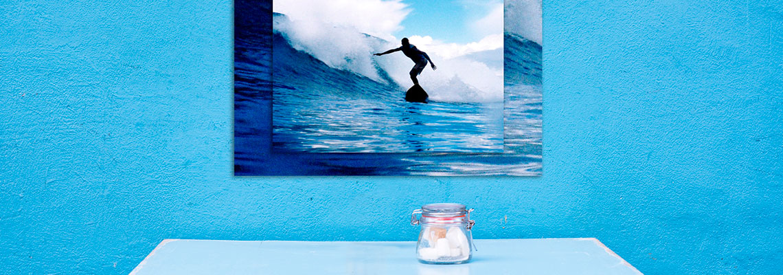
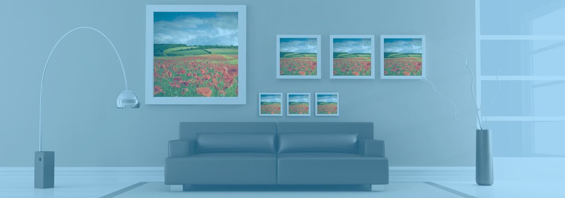
Framing and wall placement can outweigh subtle differences between paper brands. Standard glazing may create reflections that diminish the benefit of a glossy print, while an unglazed frame suits the texture of lustre. For a large wall feature where conventional paper may catch glare, options such as metal-print decor ideas provide a useful comparison, although any reflective or mounted print still benefits from controlled lighting.
Practical Recommendations by Print Purpose
The best finish follows the dominant viewing condition, the character of the photograph and the amount of physical contact the print will receive.
- Choose glossy for saturated landscapes, graphic compositions and images displayed under controlled lighting where deep blacks and strong colour impact are priorities.
- Choose lustre for portraits, family photographs, skin tones and prints intended for albums, particularly where fingerprints and frequent handling are likely.
- Select lustre for wall displays in mixed light or unglazed frames, where harsh reflections would compete with the image.
- Compare a small glossy and lustre proof in the intended room before ordering a large-format print, especially when the result will be framed or presented as a gift.
Finish is only one part of a useful printing brief. Exact dimensions, border or crop, mounting method and mounting style also affect the final presentation. Australian photographers and consumers commonly work with metric sizes such as A3 and A4, while portrait, square and panoramic formats may use dimensions in centimetres. Giving the lab a clear size and intended use helps prevent a technically accurate print from becoming awkward in its frame.
Calendars offer a useful example because each page is viewed in a different room and under changing light. A consistent lustre finish can provide visual continuity without demanding the same level of glare control as a series of glossy pages. For that project, photo-calendar ideas can help connect image selection with each month’s theme while keeping the finish practical.
Professional Printing and Final Presentation
A professional finishing lab manages more than the choice between paper surfaces. Colour-managed profiles, test prints, crop checks, proof sheets, trimming and mounting all influence the result. The Photo Place provides film developing, digital and large-format printing, passport photos, wall décor, personalised gifts, albums, framed prints and other professional output. Customers can order online or visit the retail location for assistance with paper, dimensions and presentation.
The Australian market offers online print portals, click-and-collect photography shops and a strong range of custom photo books, calendars and wall art. For purchases made within Australia, the Australian Consumer Law requires goods and services to be of reasonably acceptable quality, making clear defect, return and revision policies worth checking. Cross-border orders may instead be governed by the seller’s location and contract terms. Data handling also deserves attention: under the Privacy Act 1988 and Australian Privacy Principles, covered organisations must handle personal information responsibly, including customer images and delivery details.
The most useful rule is to remember that finish is not a universal upgrade. Glossy rewards a bold image and controlled light; lustre gives a more forgiving, versatile result for ordinary homes and frequent handling. Choose for the image’s character and the print’s real surroundings, and the paper will support both rather than fight them.