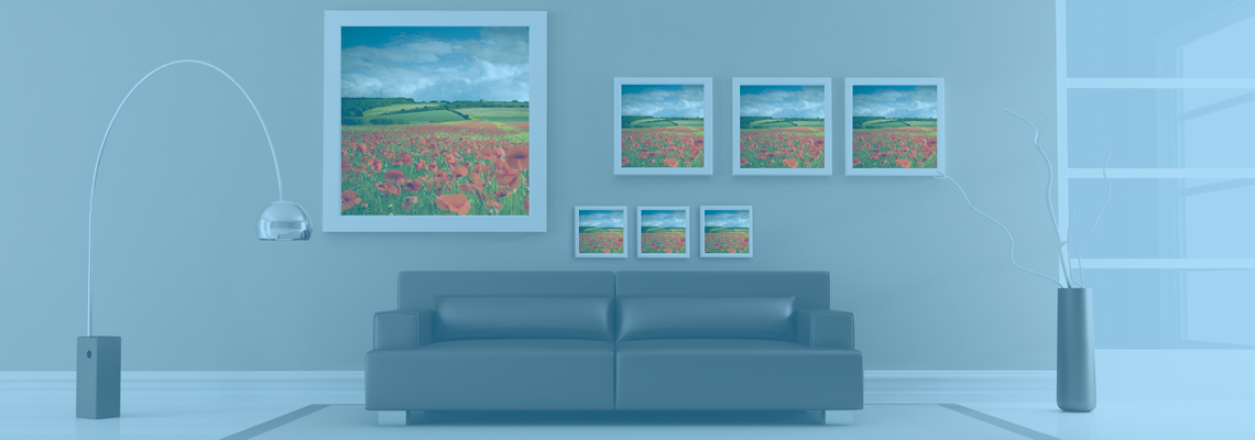
Tips for Choosing a Frame That Complements Your Photo’s Colors
A well-chosen frame should support the photograph without competing for attention. Colour, contrast, texture and scale all affect how an image feels on the wall, whether you are framing a family portrait, a landscape, a wedding print or a carefully developed roll of film. Learn more about Tips For Shooting Film In Northeast Ohio S Changing Seasons.
Australian homes often bring extra considerations. Strong daylight, pale timber floors, coastal colours and compact apartment interiors can make a frame look quite different from how it appeared under shop lighting. Taking time to compare the image, mat and frame together will help you create a finished piece that feels balanced rather than overworked.
Read The Photograph Before Choosing Materials
Start by identifying the dominant colours in the image, then look for quieter supporting tones. A photograph may appear to be mostly blue, for example, while also containing warm sand, soft grey and small touches of rust. Those secondary colours can guide your frame and matting choices without forcing an exact colour match.
Consider the photograph’s overall temperature. Warm images with amber light, autumn leaves or skin tones usually sit comfortably with walnut, honey oak, bronze or warm white. Cool images featuring water, blue shadows or green foliage may benefit from black, charcoal, silver, white or pale ash timber.
The strongest frame is often connected to a colour that appears several times in the photograph, rather than the brightest isolated detail. If a red flower is the only red element, a red frame may draw attention away from the subject. A dark neutral frame can provide structure while allowing that small colour accent to remain the visual focus.
Balance Warm And Cool Tones
Frame colour changes the apparent temperature of a print. A creamy mount can make a cool photograph feel gentler, while a blue-white mount can sharpen a warm image. This is particularly useful when a photo needs to work with existing furnishings rather than stand alone.
In a Queensland coastal home, a pale timber or soft white frame may echo light walls and natural textures. In a Melbourne terrace with darker furniture, charcoal, black or deep walnut can give a colourful print enough weight. Sydney apartments with limited wall space often benefit from slim profiles that keep the display clean and avoid making a small room feel crowded.
Black is a reliable choice for high-contrast photography, monochrome work and images with strong architectural lines. It can look too severe around a delicate pastel print, though. When the image is gentle or low contrast, try a softer charcoal, warm grey or natural timber sample before committing.
Use Matting To Create Breathing Room
A mat, sometimes called a mount, separates the picture from the frame and gives the eye a resting area. White is versatile, but there are several whites: bright gallery white, soft white, ivory and warmer cream. Hold samples beside the actual print, because a mat that looks neutral in isolation may change the image’s colour balance.
A narrow coloured mat can work when used with restraint. A muted sage mat around a botanical print or a dusty blue mat around a seascape can reinforce the image’s palette. Strong primary colours usually need a very simple frame and generous spacing, otherwise the overall display may feel busy.
The border should suit the scale of the print. A small photograph can gain presence from a wider mount, while a large artwork may need a narrower border to preserve impact. If the image contains important details near the edges, check that the window opening and frame rebate will not cover them.
For exhibition pieces, trade displays or photographic projects, the presentation must remain clear from a distance. This large-format print guide explains why print scale, viewing distance and display conditions matter when an image is enlarged.
Compare Frame Styles At A Glance
The frame’s finish and profile should reflect the image’s character as well as its colours. Glossy lacquer can intensify saturated photography, while a matte finish is usually better for images displayed near windows or under strong downlights. Textured timber adds warmth, but it may distract from a highly detailed photograph.
The table below offers a starting point rather than a strict rule. The room, print surface and personal taste still matter, so ask to see physical samples whenever possible.
| Photo colour or mood |
Frame options to consider |
Mat suggestion |
Best visual effect |
| Black and white |
Black, charcoal, silver or pale timber |
White or soft grey |
Crisp, timeless and structured |
| Warm skin tones |
Walnut, oak, bronze or warm white |
Ivory or cream |
Natural and flattering |
| Blue water or sky |
Charcoal, white, ash or brushed silver |
Cool white or pale blue-grey |
Fresh and spacious |
| Green landscapes |
Natural timber, dark brown, black or muted olive |
Soft white or sage |
Organic and grounded |
| Pastel colours |
White, light timber, champagne or pale grey |
White or a slightly deeper pastel |
Light and delicate |
| Bold red, orange or yellow |
Simple black, dark timber or neutral metal |
White or warm grey |
Keeps attention on the image |
| Moody shadows |
Black, espresso, dark bronze or deep grey |
Bright white for contrast |
Dramatic and concentrated |
If you are framing several photographs as a group, consistency usually matters more than finding a separate perfect frame for every image. Matching profiles with different mat colours can create cohesion, while identical frames and mounts can make unrelated photographs feel like a deliberate collection.
Match The Frame To The Room
Look at the wall, furniture and surrounding finishes before selecting a frame. A picture does not need to match every object in a room, but it should relate to at least one or two existing elements. Timber flooring, leather seating, brushed hardware or white cabinetry can each provide a useful visual connection.
For a rental or frequently changing interior, neutral frames are practical. Black, white, natural timber and mid-grey can move between rooms more easily than a highly specific coloured finish. If you are decorating a nursery, beach house or relaxed family room, subtle colour in the mount may add personality without requiring a permanent commitment.
The amount of natural light matters in Australia. Harsh afternoon sun can cause glare on glass and accelerate fading, especially near north- or west-facing windows. Ask about UV-protective glazing and anti-reflective options, and avoid placing valuable prints where direct sun falls across them for hours each day.
A frame should also suit the room’s proportions. Several small prints may look stronger in a grouped arrangement, while a single large landscape can anchor a blank wall. For professional photographers, albums, proof sheets, framed prints and other lab services can be planned as a consistent presentation range rather than as isolated products.
Practical Checks Before Ordering
Before placing an order, inspect the print under the lighting where it will hang. A fluorescent shop environment, warm household bulb and bright Australian daylight can each reveal different undertones. If the image was shot on film, colour shifts and grain may also influence the best frame finish; these film season tips offer useful context on how changing light affects film photography.
A local custom framer can help with conservation materials, unusual dimensions and float mounting, while ready-made frames suit common sizes and quick decorating projects. Remember that Australian metric dimensions do not always correspond neatly with US or imperial print sizes. Measure the artwork, mount opening and wall space in millimetres before ordering, particularly if the print is being produced overseas or mailed from an American lab.
Keep these checks in mind:
- Compare the frame, mount and photograph side by side rather than choosing each item separately.
- Sample warm and cool neutrals when the image contains mixed lighting or skin tones.
- Allow extra space around photographs with important details near the edges.
- Choose UV-protective glazing for valuable prints or rooms with strong sunlight.
- Confirm finished dimensions, hanging hardware and delivery requirements before payment.
Let The Image Lead The Final Decision
Colour matching should support the photograph’s atmosphere, not turn framing into a hunt for an exact shade. A frame that repeats a quiet tone can make an image feel cohesive, while a contrasting neutral can give it energy and definition. The right choice is often the one you notice after the picture, rather than before it.
When comparing options, step back several metres and view the framed sample at eye level. Check it in daylight and again in the evening, then consider how it sits beside nearby artwork. For a straightforward next step, place your printed photograph beside three frame samples—one warm timber, one cool neutral and one dark finish—and photograph the comparison in the room where it will hang.