Capture and Print Photos With Vibrant Colour
Vibrant photographs begin long before a printer lays down its first layer of ink. The strongest results come from thoughtful light, accurate exposure, intentional colour choices and a print process that preserves the character of the original image. Whether you are photographing a reef near Cairns, a footy match in Melbourne or a family gathering in Adelaide, small decisions in the camera can make the final print feel richer and more alive.
A bright screen can also be misleading. Phones and monitors are backlit, so images often appear more luminous than they will on paper. A professional photo lab can help translate digital colour into a physical print, whether you need a few 6x4 photos, a framed enlargement or a large-format display for a business or exhibition.
Find Light That Gives Colour Depth
Strong colour does not always require strong sunlight. Direct midday light in Australia can be harsh, creating pale highlights and deep, empty shadows. Early morning and late afternoon provide warmer, softer illumination that reveals texture in landscapes, skin tones and painted surfaces. The hour before sunset is especially useful for golden portraits and scenic images.
Cloud cover can act as a huge natural softbox. On an overcast day at Bondi Beach or along the Great Ocean Road, colours may look more even because there are fewer hard shadows. Watch for reflected colour, too: green grass can tint skin, while red walls can cast warmth onto nearby subjects. Changing your position by a metre or two may remove an unwanted colour cast.
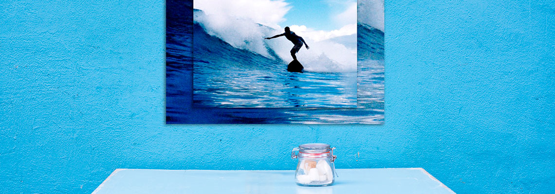
When photographing a vivid subject, place it against a quieter background. A bright yellow surfboard, colourful market stall or blue vintage car will appear more intense when surrounding tones are restrained. Look through the edges of the frame before pressing the shutter, as competing colours can make an otherwise vibrant subject look untidy.
Expose For Saturated Highlights
Digital cameras generally retain more recoverable information in shadows than in clipped highlights. If a white shirt, sunlit cloud or pale building loses all detail, colour cannot be restored convincingly later. Check the histogram and highlight warning when available, and reduce exposure slightly if bright areas are flashing or pushed hard against the right side of the graph.
This is particularly important in Australia’s bright coastal conditions and during summer sports. A camera may be fooled by a dark player against a brilliant sky, or by a pale beach filling most of the frame. Use exposure compensation to protect the brightest important detail, then lift darker areas carefully during editing.
Shoot in RAW when your camera offers it. RAW files preserve a wider range of tonal and colour information than compressed JPEGs, giving you more flexibility with white balance, highlights and shadows. Keep a correctly exposed JPEG as a convenient sharing file, but use the RAW version when preparing a high-quality print or wall piece.
Set White Balance With Care
White balance determines whether neutral surfaces look neutral and influences the entire colour mood. Auto white balance is useful for changing conditions, but it may neutralise a warm sunset that you wanted to retain. In a series of images, inconsistent automatic adjustments can also make neighbouring prints look mismatched.
For reliable colour, use a grey card or a neutral reference in the scene when lighting is difficult. This is helpful under mixed light, such as a reception venue with warm indoor bulbs and daylight through windows. Set a fixed white balance for a sequence when the light remains constant, so every frame has a consistent starting point.
Skin tones deserve special attention. A vivid image can still feel wrong if faces are too orange, magenta or grey. Make people the reference for subtle colour correction, then adjust the surrounding colours without pushing saturation across the whole photograph. A modest increase in vibrance is usually safer than a large saturation boost because it gives more protection to already intense colours and skin.
Build Colour During Editing
Editing should reveal the colour captured in the scene rather than create an artificial effect. Begin with exposure, contrast and white balance before adjusting saturation. If the image looks flat, a gentle contrast increase or a targeted boost to midtone colour may produce a more convincing result than increasing every colour equally.
Use selective colour tools for specific problems. Blue water may need a small adjustment to hue or luminance, while green foliage may benefit from reduced saturation if it has become fluorescent. Bright reds and oranges can clip quickly, so inspect those channels at close magnification. A print may show rough transitions or blocked detail that was easy to miss on a small phone screen.
Soft-proofing can make editing more predictable. It simulates the paper, ink and colour range of a print, allowing you to see which tones may change when the image leaves the screen. Keep an untouched master file and create a separate print-ready version, especially if the same photograph will be used for social media, a photo book and a framed enlargement.
Choose Paper That Supports The Image
Paper surface affects how colour is perceived. Gloss and lustre papers usually produce strong contrast, crisp detail and lively saturation, making them well suited to colourful travel images, flowers and night scenes. Lustre has less glare than high gloss and is often easier to view under household lighting or in a frame.
Matte paper offers a softer, more tactile finish. It can suit portraits, documentary work and images with gentle tonal transitions, though very deep blacks and intense colour may appear more restrained. Fine-art cotton or textured papers can give a gallery feel, but the surface becomes part of the visual statement and should be chosen with the image’s mood in mind.
Think about the viewing environment in practical terms. A print placed beside a sunny window in Brisbane may show reflections or fade faster than one displayed in a shaded hallway. For coastal homes, offices and hospitality spaces, ask about suitable inks, papers and protective finishes. A professional lab can help match the paper to the image rather than treating every file the same way.
Make Large Prints Look Naturally Rich
Large prints expose weaknesses that remain hidden on a phone. A low-resolution file, heavy noise reduction or excessive sharpening can become obvious when an image is enlarged. Capture at the highest practical resolution, avoid repeated exporting and keep the original file whenever possible.
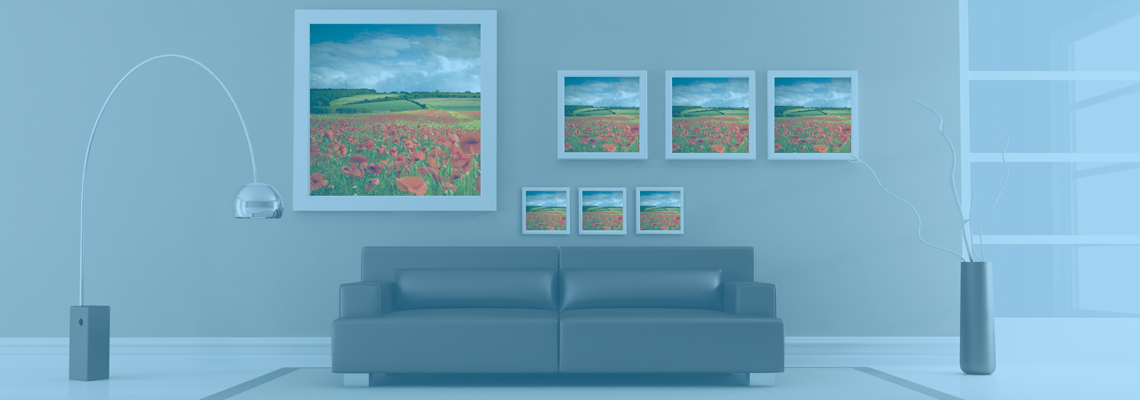
Viewing distance matters. A photograph intended for a wall is not judged from the same distance as a small desk print. A slightly softer image may look beautifully detailed from across a room, while an over-sharpened file can look harsh close up. Ask the lab to check resolution and cropping before production, especially for panoramic scenes or unusual frame proportions.
Photographers across Australia regularly need dependable output for galleries, property displays, hospitality venues and client presentations. When scale, colour consistency and finishing matter, large-format expertise can be more valuable than simply choosing the biggest available file size. The best result balances image quality, viewing distance, paper and presentation.
Prepare Files For The Printing Process
Before uploading or sending a file, check its dimensions, orientation and crop. A print ratio of 4:3 will crop differently from a 3:2 camera file, and a square frame requires a separate decision about what stays in the composition. Do not leave important faces, signs or limbs close to the edges unless you have confirmed the final trim.
Colour profiles also matter. A lab may provide instructions about RGB files, embedded profiles and preferred formats. Follow those specifications rather than converting randomly between colour spaces. Export at the recommended resolution with appropriate sharpening for the intended print size, and avoid adding borders unless you want them to be part of the design.
Keep filenames clear and retain a record of the version sent for printing. This is useful when ordering wedding albums, school portraits or a run of exhibition prints. The Photo Place provides online photo services alongside retail assistance, which can be useful when you need guidance with printing, finishing or personalised products from a distance.
Protect Colour After Printing
Even an excellent print can suffer if it is displayed in direct sun, exposed to damp air or handled with dirty hands. Use clean, dry hands around the edges, and choose archival-quality materials when the photograph is intended to last. Acid-free mounts and suitable glazing help reduce long-term damage.
Glass can reflect light and create distracting hotspots, while acrylic may be lighter for larger pieces and safer in busy spaces. UV-filtering glazing can reduce the effect of sunlight, although it does not make a print invulnerable. Keep framed photographs away from heaters, steamy bathrooms and walls that experience condensation.
Dust the frame gently with a soft, dry cloth rather than spraying cleaner onto the glass. If you are unsure how to care for an older or valuable piece, these framed photograph care tips provide a sensible starting point. Regular, gentle maintenance is safer than aggressive cleaning after grime has built up.
A vibrant print is the result of a complete chain: flattering light, protected highlights, accurate colour, restrained editing, suitable paper and careful display. Before ordering, view the image at its intended size, confirm the crop and choose a surface that suits the room. For dependable results, make those checks part of your routine every time you turn a colourful scene into a physical photograph.