How to Create a Photo Collage That Balances Color and Composition
A successful photo collage feels intentional rather than crowded. Each image contributes to a visual rhythm, while colour, scale, spacing and subject matter work together to guide the eye. Whether you are arranging travel photographs from Sydney and Melbourne or building a family display for a Brisbane home, the strongest results begin with a clear idea of how the pictures should relate.
A collage can be printed as a single poster, arranged across several frames, or turned into a personalised gift. Digital tools make experimentation easy, but the final piece still benefits from careful editing and professional output. By choosing a considered palette and giving every photograph room to breathe, you can create a display that feels balanced in both digital and printed form.
Start With A Clear Visual Story
Before selecting images, decide what the collage is meant to communicate. A collection of beach photographs might celebrate an Australian summer, while a family arrangement could trace a child’s growth or bring together several generations. This purpose helps you remove attractive images that do not support the overall story.
Choose a lead photograph first. It might show a recognisable face, a striking landscape or an important moment. Supporting images should add context, detail or emotion without competing with that anchor. For example, a collage based on a road trip from Adelaide to Perth could combine wide landscape views with smaller photographs of roadside stops, meals and travelling companions.
Aim for variety within a consistent theme. A sequence made entirely from distant landscape shots can feel flat, while a mixture of close-ups, portraits and wider scenes creates movement. Look for repeated shapes or details, such as circular wheels, curved coastlines, windows or tree branches. These visual links make different photographs feel connected.
It can help to create a temporary digital folder or lay printed proofs across a table. Move the images around without committing to a final arrangement. At this stage, concentrate on the narrative and remove duplicates before making detailed colour adjustments.
Build A Colour Palette That Feels Connected
Colour is one of the quickest ways to make a collage look unified. Review the dominant tones in your photographs and identify two or three colours that appear repeatedly. Australian coastal images may contain aqua water, warm sand and blue sky, while a Melbourne laneway collection might lean towards brick red, charcoal, green and muted urban tones.
You do not need every photograph to share the same colour balance. A contrasting image can provide a useful focal point, especially when surrounded by quieter tones. The key is to control the contrast. If several highly saturated images sit together, the collage may feel noisy; placing them beside neutral or softly edited photographs gives the eye a visual pause.
Consider editing the images with a similar finish. Matching exposure, warmth, contrast and saturation often creates more cohesion than applying an identical filter. Black-and-white photographs can work beside colour images, but use them deliberately. A single monochrome portrait may act as an elegant accent, whereas several unrelated black-and-white images could divide the arrangement into separate visual groups.
Australian sunlight can be particularly intense, especially in photographs taken around Perth, Darwin or the Queensland coast. Highlights may be harsh and shadows very dark, so reduce excessive contrast before printing. A professional lab can also help assess whether the files are likely to reproduce with the intended depth and colour.
Arrange Scale, Space And Movement
Composition determines how the viewer travels through the collage. Place the most important image where it will receive attention, then use neighbouring photographs to lead the eye towards it. A face, bright colour or strong diagonal naturally attracts attention, so avoid placing several competing focal points together.
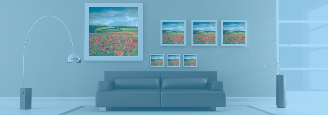
Varying image sizes creates hierarchy. A large hero photograph can be surrounded by smaller supporting prints, while a grid of equally sized images creates a calmer, more orderly appearance. For a modern wall display, consider a large central print with smaller images arranged around it. For a family album or framed poster, a structured grid may be easier to read.
Spacing is just as important as the photographs themselves. Narrow gaps create energy and density; wider gaps provide a clean, gallery-style feel. Keep margins consistent where possible, especially if the collage will be mounted in a frame. Remember that Australian paper and frame sizes may be listed in metric measurements, so check whether your design suits A4, A3 or a custom large-format print before exporting.
| Collage Style |
Best For |
Colour Approach |
Composition Guidance |
Printing Consideration |
| Structured grid |
Family milestones and event records |
Similar editing across all images |
Equal sizes and consistent gaps |
Works well as a poster or framed print |
| Central feature layout |
Travel stories and major celebrations |
One strong accent colour |
Large lead image with smaller supporting photographs |
Choose a surface that preserves fine detail |
| Organic arrangement |
Creative portraits and lifestyle images |
Related tones with selective contrast |
Varied sizes and relaxed spacing |
Proof the design before large-format production |
| Monochrome-led collage |
Elegant interiors and formal memories |
Black, white and one restrained accent |
Strong shapes and tonal balance |
Matte paper can reduce distracting reflections |
| Multi-panel display |
Wall decor and room-scale storytelling |
Palette linked across separate panels |
Let each panel stand alone while forming a whole |
Measure the wall and hanging gaps carefully |
Keep the viewing distance in mind. Tiny details that look impressive on a laptop may disappear when the collage is displayed in a hallway. Conversely, a design viewed close-up can tolerate smaller photographs and finer borders. Print a rough version at reduced size to check whether the hierarchy remains clear.
Edit For Consistency Before Printing
Once the layout is close, inspect every image for technical and visual distractions. Straighten horizons, crop away unnecessary edges and check that people are not positioned awkwardly near a cut line. Avoid placing a person’s face too close to the outside edge unless the crop is clearly intentional.
Resolution matters when several photographs are combined into one large file. Use the highest-quality originals available, particularly for hero images and large-format output. Social media downloads often contain too little detail for a sharp poster. If an older photograph is important, a professional lab may be able to scan and restore it before it enters the collage.
Think about the viewing environment. Gloss paper can make colours appear lively, but it may reflect windows and ceiling lights. Matte or lustre finishes are often easier to view in bright Australian homes, especially in rooms with strong afternoon sun. A framed collage for a coastal house may need a finish that limits glare and helps protect the print from fading.
For official images, keep the design separate from documents that must meet strict requirements. If your project includes updating family records or preparing travel paperwork, check the current passport photo requirements rather than cropping a creative portrait into an official image. The two purposes demand different lighting, expression and framing standards.
Choose A Print Format That Completes The Design
The final medium should support the collage rather than distract from it. A single large print works well when the layout has a strong central image and a restrained border. Several framed prints offer flexibility and can be rearranged as a family grows. Canvas, acrylic and mounted board each create a different visual presence, so consider the room’s texture, lighting and existing decor.
For gifts, a collage can become a calendar, greeting card, photo book cover or personalised wall piece. A collection of photographs from a Sydney wedding might suit a refined album, while snapshots from a summer holiday could work as a bright square print for a kitchen or home office. Choose the format after the composition is established, not before.
A proof is valuable when colour balance is important. It reveals whether pale backgrounds have become too faint, whether skin tones look natural and whether text or borders have sufficient contrast. Keep an eye on the difference between screen brightness and printed density; monitors are often brighter than paper, so a design that looks subtle onscreen can print darker than expected.
Once printed, handle the collage with clean, dry hands and keep it away from direct sunlight, humidity and rapid temperature changes. Guidance on preserving printed photographs can help you choose suitable storage materials and display conditions. This is especially useful for valuable family photographs, older film images and prints intended to last for decades.
Refine The Display With A Final Visual Check
Stand back from the completed design and assess it as a whole. Does your eye move naturally from the main image to the supporting photographs? Are any colours unexpectedly dominant? Is one corner too heavy because it contains several dark or detailed images? These questions are easier to answer after taking a short break from the layout.
A useful final test is to view the collage as a small thumbnail or in grayscale. The thumbnail reveals whether the composition has a clear hierarchy, while grayscale shows whether the tonal structure works independently of colour. If one image disappears completely, it may need a brighter exposure, a stronger crop or a more prominent position.
Do not be afraid to leave empty space. A quiet area can separate two visual stories, emphasise a face or make a vivid colour appear more deliberate. The same principle applies when collecting online reference material: even a visually distinctive interface reference can be studied for colour contrast and layout, but it should support the design rather than overwhelm it.
The finished collage should feel connected at first glance and rewarding up close. Select images with a shared purpose, repeat colour cues, vary scale thoughtfully, preserve consistent spacing and choose a print finish suited to its surroundings. What the reader should remember is simple: balanced colour attracts attention, considered composition controls it, and careful printing gives the visual story a lasting form.