Negative Space That Makes Printed Photos Feel Intentional
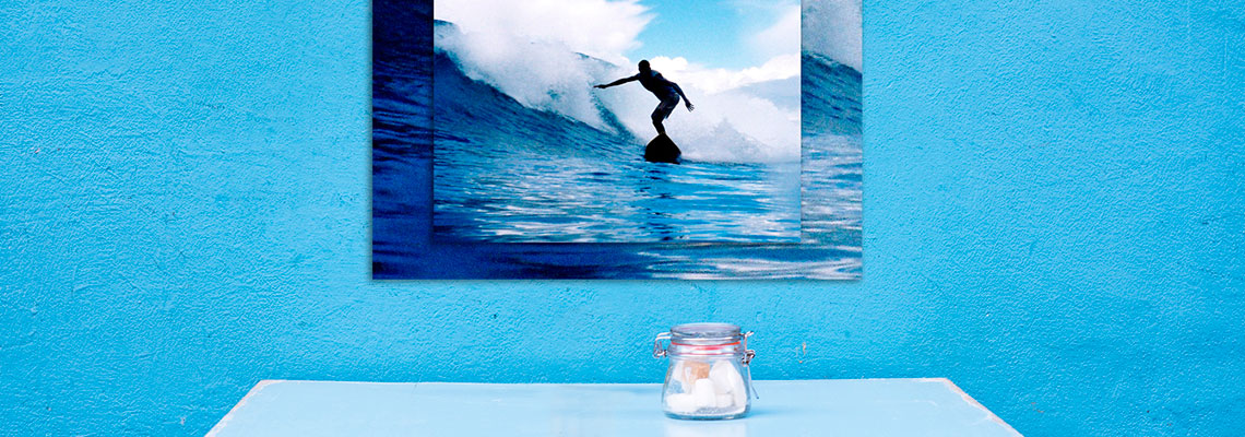
Negative space is the quieter area around your main subject: a clear sky above a surfer, a plain wall beside a portrait, or a stretch of pavement leading towards a building. Learning how to use negative space in your photo compositions can make an image easier to read, more balanced on paper and better suited to a frame, album or large-format print.
A photograph that looks powerful on a phone may feel strangely crowded when printed. Screens are small and bright, while paper reveals the relationship between the subject, the edges and the empty areas around them. A carefully placed area of calm gives the eye room to move and can make a modest print feel considered rather than sparse.
This approach works across film, digital photography and scanned negatives. It is useful for Australian scenes such as broad beaches, open bushland and bright suburban architecture, as well as for tighter images made in Sydney laneways or Melbourne cafés. The key is to treat open space as an active part of the composition, rather than as leftover background.
| Subject and setting |
Useful negative space |
Printing advantage |
Common risk |
| Portrait against a plain wall |
Space in the direction of the gaze |
Allows comfortable cropping and matting |
Subject may appear detached |
| Surfer or swimmer at the beach |
Open water or sky ahead of movement |
Creates a strong landscape print |
Horizon may divide the page |
| Product or craft photograph |
Clean area beside the object |
Leaves room for text or a wider mat |
Empty area can look accidental |
| Architecture and interiors |
Wall, pavement or sky around the structure |
Emphasises shape and scale |
Fine details may disappear at small sizes |
| Gum tree or bushland scene |
Clear sky between branches |
Gives a calm, spacious wall image |
Bright sky may overpower the subject |
Give Empty Space A Purpose
Negative space becomes effective when it supports the story of the photograph. Space in front of a moving cyclist suggests direction; space above a lone tree can communicate isolation; a pale wall beside a face can create stillness. Before pressing the shutter, identify what the open area is doing emotionally and visually.
Look for visual interruptions that weaken that purpose. A rubbish bin near the edge, a bright sign behind a person or a stray branch touching the subject can make the image feel untidy. Moving a step sideways, lowering the camera or waiting for a passer-by to clear the frame often creates more useful space without any complicated editing.
The direction of attention matters as much as the amount of background. If a person faces left, leaving room on the left usually feels natural. If the subject looks towards the edge, the frame may feel tense or deliberately compressed. Neither choice is automatically right, but it should be made with intention.
For Australian landscapes, open space often arrives naturally through sky, ocean and pale sand. Watch the exposure carefully: a huge white sky can lose texture in a print, particularly on glossy paper. Retaining subtle cloud detail or a gentle colour shift gives the quiet area enough tonal information to remain part of the image.
Compose For The Paper, Not Just The Screen
A camera sensor and a sheet of paper rarely share the same proportions. A standard digital frame may be close to 3:2, while an A4, A3 or A2 print has a different shape. A square social-media crop, a 6x4-inch print and a wide frame each require a different amount of breathing room.
When photographing with a future print in mind, leave a little space around important edges. This is especially helpful for portraits, wedding photographs and images destined for albums, where cropping may be needed to fit a particular format. Avoid placing a face, hand or horizon so close to the border that a small trim would damage the balance.
Negative space can also protect an image from feeling cramped after mounting. A framed print usually needs a visual margin between the picture and the surrounding wall or mat. If the composition already has breathing room, the finished piece can feel polished. If the original frame is packed tightly, even a well-made mount may make it feel more confined.
Consider the viewing distance as well. A large wall print in a Brisbane home needs broad shapes and clear separation, while a small desk print can support finer detail. A distant viewer reads the overall balance first, so open areas should have a clean silhouette and enough contrast to keep the subject visible.
Use Tone, Colour And Texture Carefully
Empty space does not have to be blank. A softly rippled sea, a painted wall, fog, shadow or an out-of-focus garden can provide texture without competing with the subject. These quieter details help the print feel finished and prevent the background from appearing like an accidental gap.
Contrast determines whether the subject stands apart. A dark figure against a pale sky is immediately legible, while a pale subject against a light background may need stronger edges or a change in viewpoint. On film, the result depends on exposure and development as well as scanning. Subtle transitions in a negative can be lost if the scan is too contrasty.
Colour carries visual weight. A small red jacket in a wide field of green may dominate the composition, while a muted subject in a warm, open landscape may feel gentle. When printing, ask whether the paper finish supports that relationship. Lustre paper can control reflections while retaining colour, whereas glossy paper may give bright tones extra impact.
For photographers drawn to analogue processes, the character of the material is part of the composition. The history of Polaroid shows how instant photographs have long used broad borders and simple layouts to make a small image feel distinctive. Those borders are not the same as compositional negative space, but they demonstrate how restraint can become a recognisable visual feature.
A Quick Negative-Space Checklist
Use these checks while shooting or reviewing a contact sheet. They help separate deliberate simplicity from an image that merely lacks information.
- Identify the subject’s direction, movement or gaze.
- Check the frame edges for bright distractions.
- Look for a clear tonal difference between subject and background.
- Decide whether the empty area supports the mood.
Before ordering prints, review the image at the intended size rather than relying only on a phone preview. Make a small proof if the photograph will become a large wall piece. A detail that seems invisible on screen may become obvious at A3 or larger, while a gentle texture may disappear when reduced to a small format.
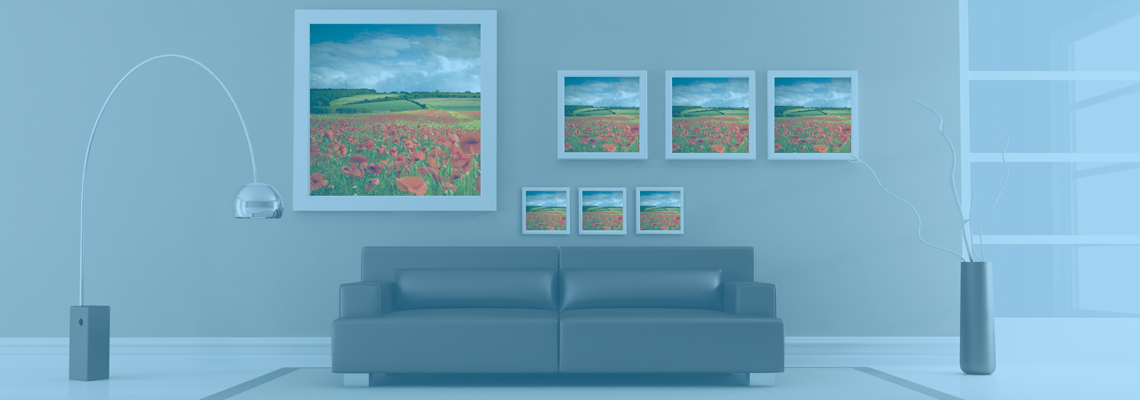
For a collection, consistency often matters more than making every image identical. Similar margins, related backgrounds or a shared colour treatment can help a series sit together. At the same time, vary the amount of open space so the display has rhythm rather than looking like repeated templates.
- Use more breathing room for calm, reflective subjects.
- Tighten the crop for energy, tension or graphic impact.
- Keep important details away from likely trim lines.
- Compare matte, lustre and glossy surfaces before a large order.
Prepare The Image For Its Final Display
Editing should strengthen the original arrangement rather than erase its character. A small crop can remove an intruding object, but extensive cloning may create a background that looks unnaturally smooth. Adjust highlights, shadows and colour gently so the open area remains quiet without becoming lifeless.
Sharpness also needs to suit the output. A file prepared for a small print may not need the same sharpening as a photograph intended for a framed enlargement. Ask the finishing lab about resolution, file dimensions and preferred colour settings before making a large order. This is particularly useful when moving between a phone image, a scanned negative and a professional digital file.
Framing changes how negative space is perceived. A narrow border may make an already open composition feel expansive, while a broad mat can add structure and give the subject a gallery-like presentation. The custom framing guide explains how frame style, matting and glazing can influence the final relationship between image and wall.
Think about the room where the print will live. Australian interiors often combine strong daylight with pale walls, timber, concrete or textured finishes. A low-contrast photograph may fade in harsh afternoon light, while a heavily saturated image can dominate a small room. Choose the print size and frame together, allowing the photograph’s open areas to work with the surrounding space.
From Capture To Finished Print
A reliable workflow starts with the intended use. Mark photographs for an album, gift, framed enlargement or digital gallery, then make a crop suited to each purpose. Do not force one version to serve every format. A portrait with generous space above the head may work beautifully as a tall print but require a careful crop for a square album page.
If your source material includes family tapes or older recordings alongside photographs, professional video transfers can preserve those memories in a more accessible format. Keeping related images and moving-image files organised makes it easier to plan a family archive, a commemorative display or a set of gifts.
A professional lab can also reveal issues that are easy to miss at home, including uneven borders, weak shadow detail and resolution limits. The Photo Place has served the Youngstown, Ohio area since 1983 with film developing, digital printing, large-format output, passport photos, wall decor and professional finishing. Mail-in processing and online ordering can be useful when local options are limited, including for photographers planning work across distance.
Start with one photograph that has a clear subject and generous open space. Make an A4 proof, inspect the edges and tones under ordinary room light, then adjust the crop before ordering the final print or framing.